Changing the way residents view downtown Sudbury is the main goal behind a rebranding campaign unveiled Wednesday night at Downtown Sudbury's annual general meeting.
The campaign is based on a pushpin graphic with a 'D' in the centre, similar to the graphics on online maps that highlight the location of whatever site you're searching for. The graphic is twinned with the tagline, 'Downtown: A place for you since 1883.'
Jeff MacIntyre, chair of Downtown Sudbury, said a lot of good things have happened recently that have had a big impact on the area – the new school of architecture, the new market square, the Elm Street parking program, and the thriving restaurant and entertainment scene.
“We needed to change the face, change the brand downtown,” MacIntyre said. “We're trying to change that story. We're trying to show off downtown and the great things that are happening here. So we wanted the tools, we wanted a brand we could put forward that tells that story.”
Frank Chartrand, of Bureau, told the crowd that when the firm was working the rebranding, they surveyed people online to see what they thought of downtown in one word. Common in the feedback, Chartrand said, were words like “boring, lifeless, neglected.”
The campaign aims to change the way Sudburian's view the area.
“Why are we doing this? Why rebrand downtown?” he asked. “It's because these are some of the perceptions people have about downtown, and we want to change that.”
People who live and work there already know what the area has to offer, he said. The concept revolves around showing the public that downtown “really is a place like no other in Greater Sudbury.
“We want to remind everybody else in the community about the hidden gems downtown – theatre, arts, dining, etc.”
The tagline highlights the area's long history, and alerts residents to the fact downtown has been around since 1883.
“We think that's really impressive — not many cities go back to the 1800s,” Chartrand said.
The font they chose was created around the same time as downtown was founded, he said. They used it because it “has a nice, strong, modern look to it, but is actually very old.”
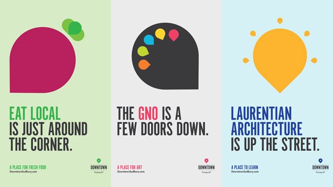
The pushpins will be combined and transformed on posters that will go up in different spots, alerting visitors about what's on offer in that part of downtown. For example, pushpins are used to form a vegetable on one poster for Eat Local Sudbury, and the tagline is changed to “A place for fresh food.” The poster for the GNO has pushpins rearranged into a painter's palette and reads, “A place for art.”
A colour-coding system will be assigned to specific types of downtown locations – retail, arts, entertainment, education, etc., to make it easier for visitors to discover and locate what interests them.
Campaign is aimed at “those who love downtown and those who will love it soon enough,” he added.
Established in 1977, Downtown Sudbury is the business improvement association that includes the 90 property owners and 400 businesses in the area. It advocates for economic development for downtown, including marketing and lobbying efforts.
@darrenmacd
Join Sudbury.com+
- Messages
- Post a Listing
- Your Listings
- Your Profile
- Your Subscriptions
- Your Likes
- Your Business
- Support Local News
- Payment History
Sudbury.com+ members
Already a +member?
Not a +member?
Sign up for a Sudbury.com+ account for instant access to upcoming contests, local offers, auctions and so much more.